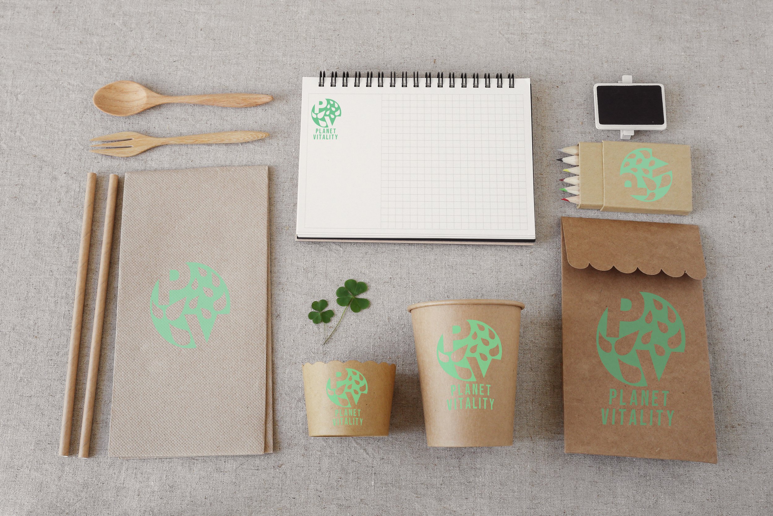
Brand Identity: Planet Vitality
The project for Planet Vitality is based on creating a brand that was a ‘call to action responsive company, addressing power consumption and our carbon footprint. The project’s motive was to develop technical and design skills by creating minimal visuals that were also informative, while also working within and embracing design constraints. Planet Vitality was created and worked to motivate and influence others to go outside and enjoy mother nature without relying on power.


Marketing promotional poster for Planet Vitality. Shown on an off-white wall, outside in the sun, with a shadow overlay of a tree nearby.
Logo Development Process
For the branding, Planet Vitality was going to work as a club where when one joined they would receive ‘gifts’ that make the member’s outdoor activities more enjoyable. The items were to consist of cups like mugs, biodegradable cups, sketch pads and pencils, light camp accessories, tote bags, etc. The pictures above and to the right are some of the concepts that were developed over the course of two months. Other times such as pamphlets and posters were made to establish branding. Early brand development consisted of tote bags, in its first rendition with the early Planet Vitality logo. Also shown above is an early version of the Planet Vitality poster design. On the right is the logo process, beginning with a tree and planet design which moved onto the circle was a full month’s process to finalize.
Project executed in Adobe Illustrator and Adobe Photoshop.


